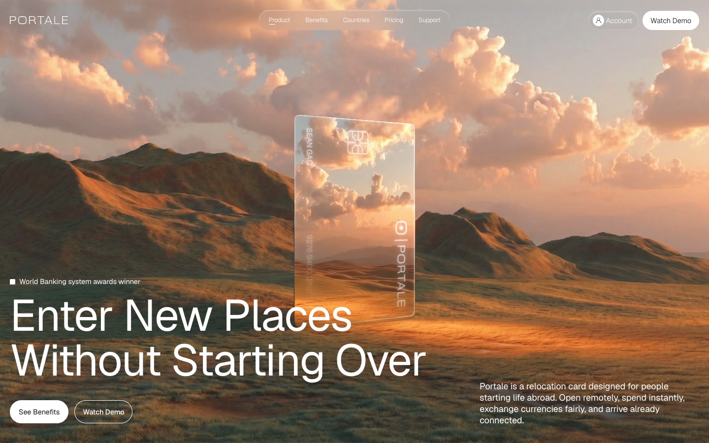
A SaaS website has one job most other sites don't: it has to explain something that often doesn't exist anywhere else yet. There's no shared vocabulary a visitor already understands, so the site has to build that understanding in seconds, or they leave. That's a harder problem than most AI prompts are set up to solve.
Why "build me a SaaS landing page" doesn't work well
Ask an AI coding tool for a SaaS landing page with no further detail, and you'll get the same page regardless of what your product does: a centered headline promising to "streamline your workflow," a product screenshot inside a browser mockup, three feature cards, and a pricing table. None of that is wrong exactly, it's just generic enough to describe almost any SaaS product, which means it doesn't explain yours.
The underlying issue is the same one that shows up everywhere else AI website building goes generic: a vague instruction gets filled in with the statistical average of everything labeled "SaaS landing page," and that average aims at looking like the category rather than explaining your specific product.
What makes a SaaS site work
- The product has to be visible, not just described. A real screen, a short interaction, something that shows rather than tells.
- The value has to be legible to someone outside the company. The team building the product already understands it; a stranger needs it translated.
- The structure should match how someone decides, not a generic hero-to-footer flow: what is this, who's it for, does it work, what's the next step.
A finished design that already solves this structural problem gives you a head start that a text prompt can't, because the structure is baked into the layout itself, not something you have to specify from scratch.
Where to start
uberdesigner.ai's library has templates built around exactly this kind of product-first structure: a real place for a product demo or interactive element, clear sections for explaining value to someone unfamiliar with the category, and a visual system built to make a new idea look established rather than unfinished. Each template comes with a prompt for Claude, Cursor, Codex, or Kimi, plus a Vite + React project and a Figma file for your team.
A free account covers three templates a day for personal use. Paid plans unlock the full library for commercial and client work, which covers an actual company launch rather than a prototype.
FAQ
What's the biggest mistake SaaS founders make with an AI-built site?
Describing the product in the prompt instead of showing it. A paragraph explaining what your software does is less convincing than a real screen or interaction demonstrating it.
Should a SaaS landing page explain the product or sell it first?
Both, in order. A visitor who doesn't understand what the product is won't be persuaded by a sales pitch; explanation has to come before conversion copy, not after it.
Can an AI coding tool handle an interactive product demo on the landing page?
Yes, if the reference or template you're starting from already has that kind of interaction built in. It's much harder to get a text prompt to invent an interactive demo from scratch.
Does the AI tool matter more than the starting design for a SaaS site?
No. The starting design determines whether the structure matches how someone evaluates a new product. The AI tool is mainly responsible for assembling that structure into working code.